MijnRapportfolio
UX design for MijnRapPortfolio, a platform where students track progress and personalize their portfolio.
UX design for MijnRapPortfolio, an interactive platform where students review their educational progress and customize their personal pages with portfolio work. Designed for clarity and ease of use, it empowers students to showcase their growth in a personalized and engaging way.


Target Group Analysis
The target audience analysis shows that student engagement is crucial for the platform. Additionally, 24% of students have a migrant background, making clear language essential for accessibility. Meanwhile, 36% are in higher education (HAVO/VWO), reducing the learning curve for first-time users.
Creating personas helps visualize the target audience for a clearer understanding.

Survey
These are the key findings from the survey, which provided insight into student expectations for the MijnRapportfolio platform. The survey also helped identify its competitors.


The research was made in collaboration with the following schools:

Low fi prototype
Based on user interviews and research, the low-fi wireframe for MijnRapPortfolio ensures a clear and intuitive experience. It maps essential features, optimizing navigation for students to track progress and customize their portfolios. This early design phase prioritizes functionality, accessibility, and user needs.


Branding
After completing the wireframes, the next step was to develop the overall branding of the app. This included defining the visual language, selecting a cohesive color palette, choosing appropriate fonts, and designing logos. The goal was to create a consistent and visually appealing identity that enhances user experience and aligns with the platform’s purpose.

The logo for the new MijnRapportfolio VO platform features its mascot—an owl, already familiar to users. Designed with flat-design principles, it emphasizes minimalism and flexibility. This choice reinforces recognition and trust among the target audience.


The color palette is intentionally limited to maintain brand clarity. Research shows that bright colors appeal to the audience, while blue conveys confidence.
The primary font, Open Sans, is elegant, simple, and easy to read, ensuring a clear and neutral look for MijnRapportfolio.
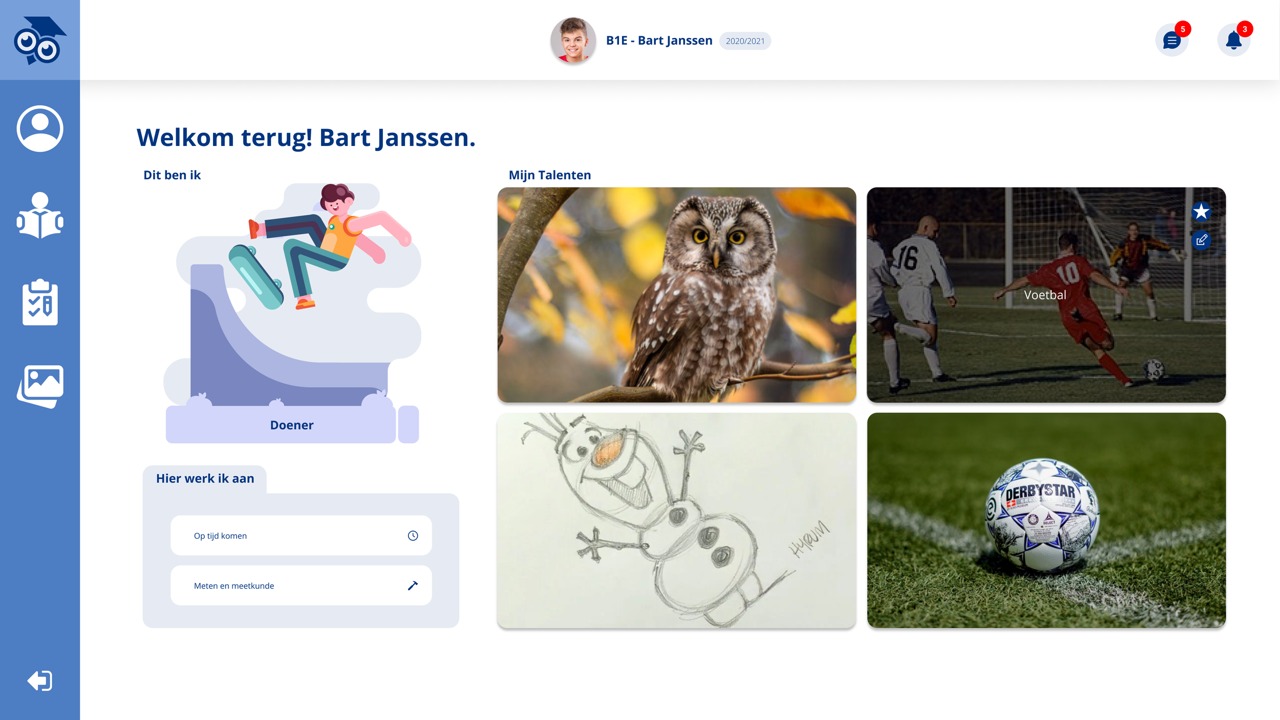
Designs
We designed MijnRapportfolio with a clean, modern, and user-friendly interface, ensuring intuitive navigation and a visually engaging experience. The minimalist yet vibrant style enhances accessibility while maintaining a professional and trustworthy look.